Overview
Design and coding done for Smith School of Business at Queen's University and the IT department.
Updating Their Brand
One of my jobs was updating the styling and branding on D2L. They were in the process of moving from one brand to another, switching out D2L's branding for their own and updating from Bootstrap 3 to Bootstrap 4 which is a front-end component library that combines HTML, CSS, and JS.
Widgets
The first things I was given to update was the widgets on the Smith School of Business D2L page.
I was given screenshots of a layout and styling for the new directory page that students were using. A prominent design feature of the new directory page was the flat cards with arrows that moved across to signal the student moving to a new page.
The majority of the styling was changed in the CSS files hosted on D2L, changing class names and colours, then updating classes in the HTML. One of the last pieces left for the widgets was to get the hover working for the arrows. A tough problem to solve was how to get the arrow to land in the same place every time it moved no matter what the distance it had to travel was. In the end, I used a combination of JavaScript and CSS to create this hover effect.
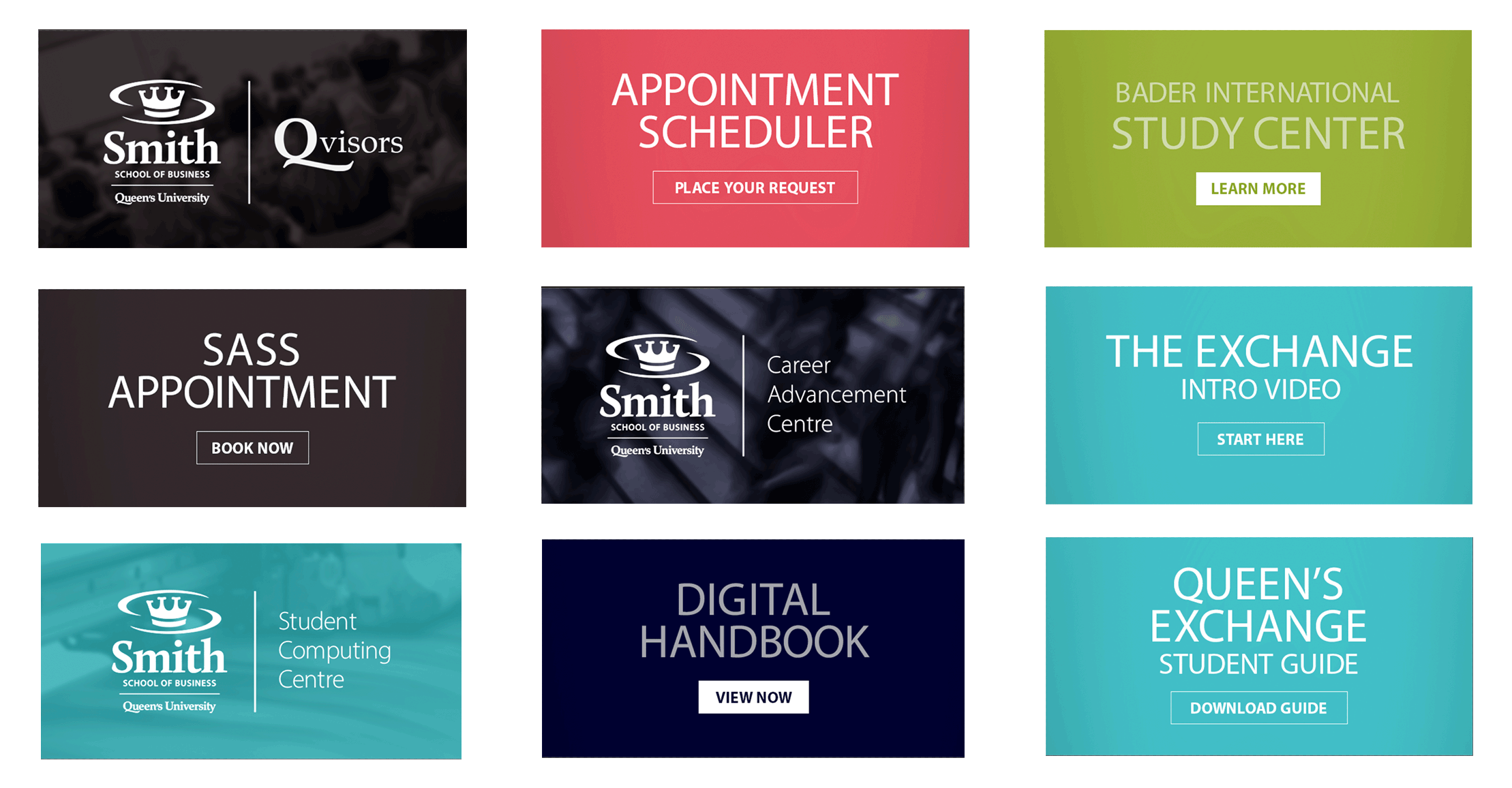 Old styling
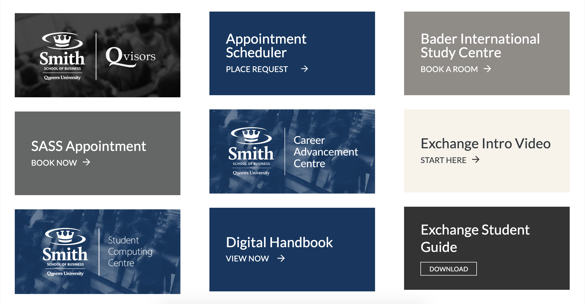 New styling
Templates
I was tasked with restyling the templates that professors use to build their sites and holds all the information for their courses. D2L had built most of the templates but they had the D2L styling.
While updating their templates, I learned how to style around other people's work while making sure not to break things and if things broke, being able to fix them. The JavaScript was not too hard to work around, being able to keep track of how it worked was a great skill to learn. Below is a video showing off the new styling of the template as well as the interaction with all of the features.
Not shown are a few simpler templates that are used for longer chunks of text or beginning explanations to a new module.
Coaching Pages
These pages were for people seeking coaching for their program. The original style was extremely outdated, a few years worth of rebranding had happened without these pages getting redone. I was given "free" reign of the pages, tasked with making them look like the new styling, specifically the templates since students would be familiar with the look and function.
Below are the three pages that needed to be restyled, the coaches page was the most drastic update, changing from a tab view to an accordion view. This prevented users from having to scroll away from the coaches' picture like the previous styling required. This format keeps all of the necessary information together and allows a user to quickly scroll through all of the coaches without having to repeatedly scroll up and down the page.
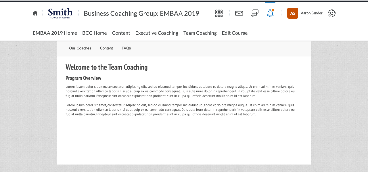 Old styling Intro Page
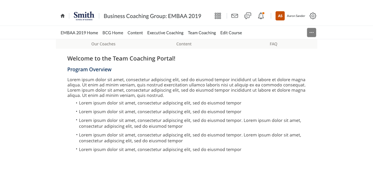 New styling Intro Page
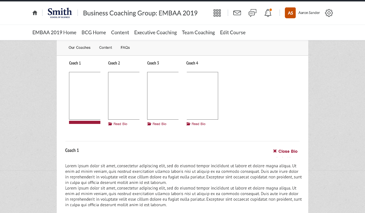 Old styling Coaches Page
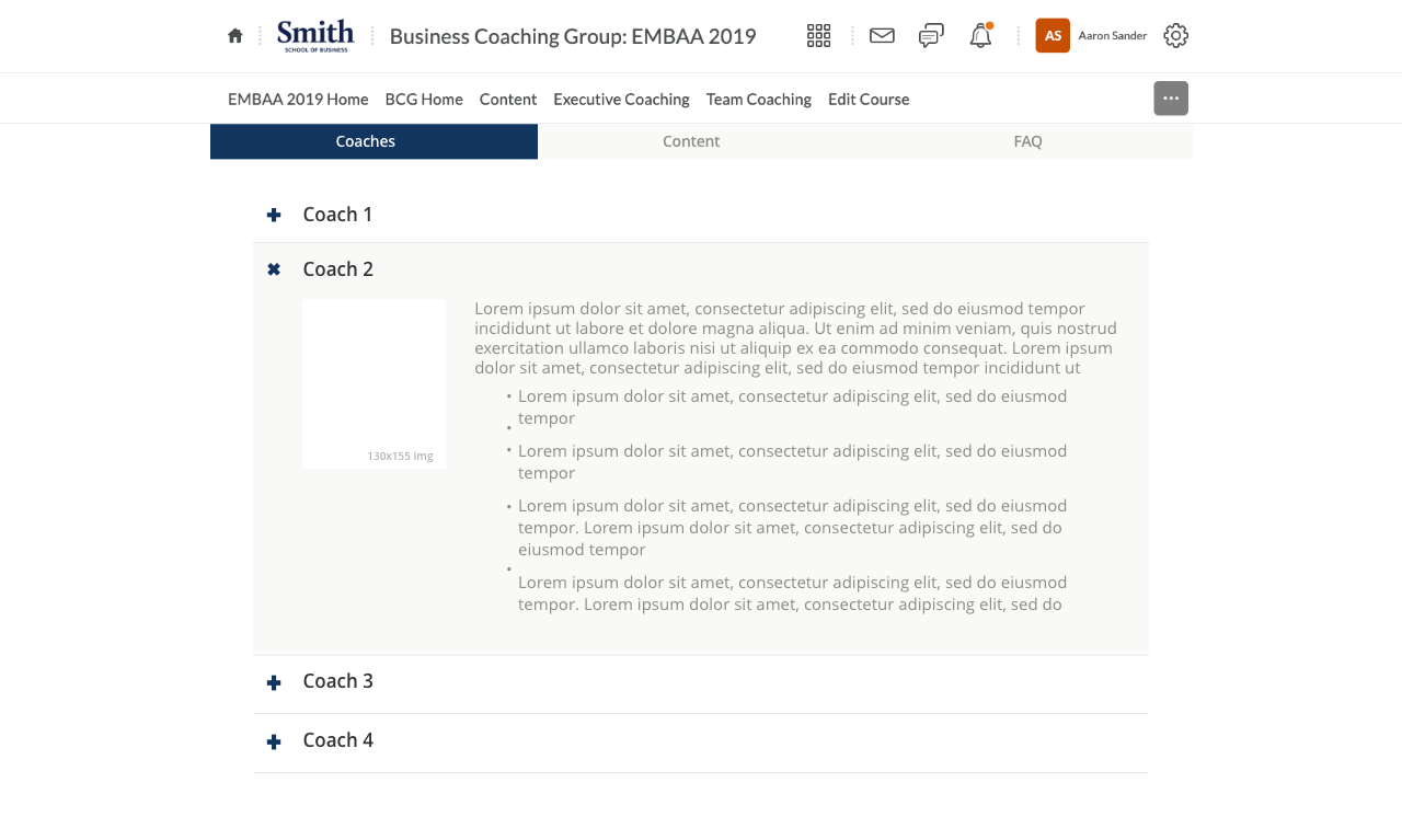 New styling Coaches Page
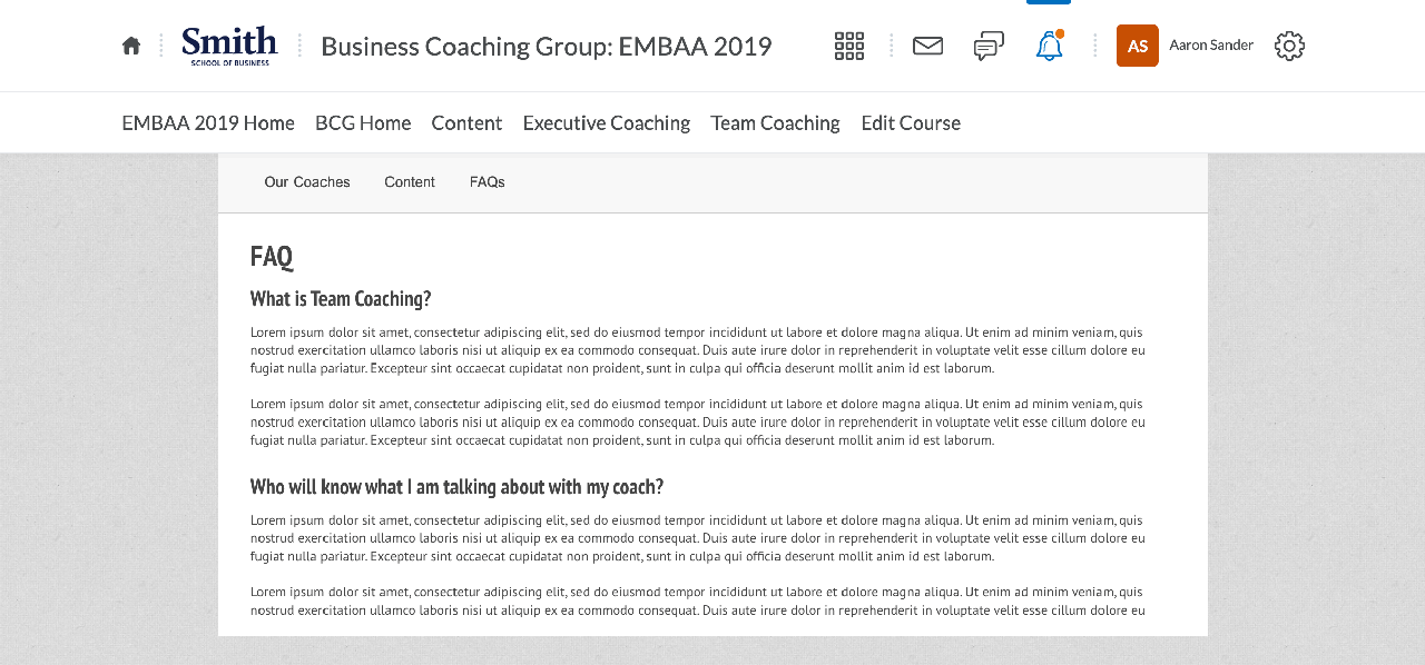 Old styling FAQ Page
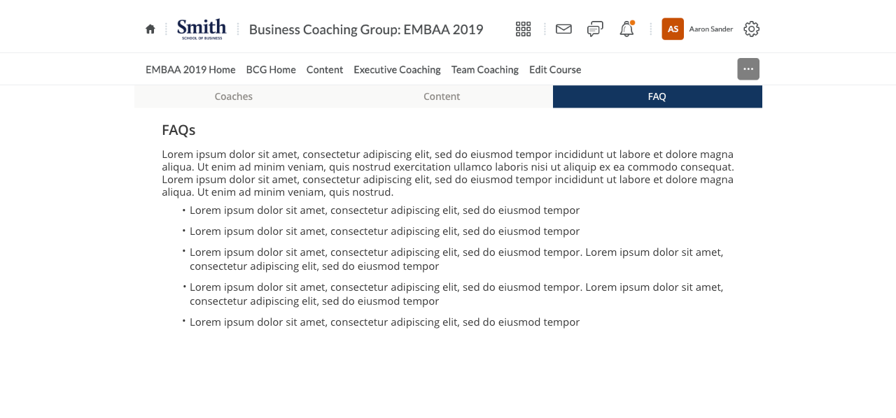 New styling FAQ Page
