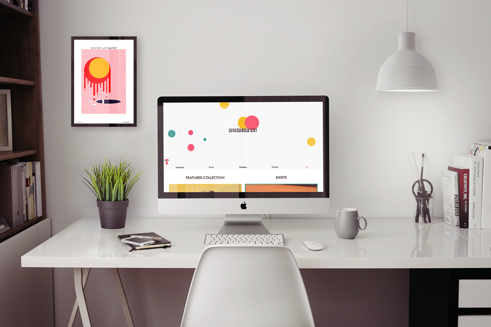
Overview
Creating an e-commerce site using a pattern library. Every pattern is coded in its own HTML file, in a pattern folder and draws from a CSS file in the pattern folder. To build each page, patterns are called out and pieced together with only minimal amounts of HTML to structure them.
Process
Research
When I was initially tasked with creating an e-commerce site, I knew I wanted to create a t-shirt brand for some of the weird art that I have made in the past. I knew roughly who I wanted to target but didn't really know how or why. All my research was done to narrow down my target group and influence my decisions when the time came to start designing. All this research helped me create my website goal and strengthen my idea of how I wanted the site to be perceived.
Website Goal
Mushroom Boy is a unisex t-shirt, hoodie and jacket shop. The goal is to sell a unique brand of clothing to people looking for unisex clothing. As well, the website should represent the brand and the stylistic choices should coincide with the appearance of the clothing.
Target Audience
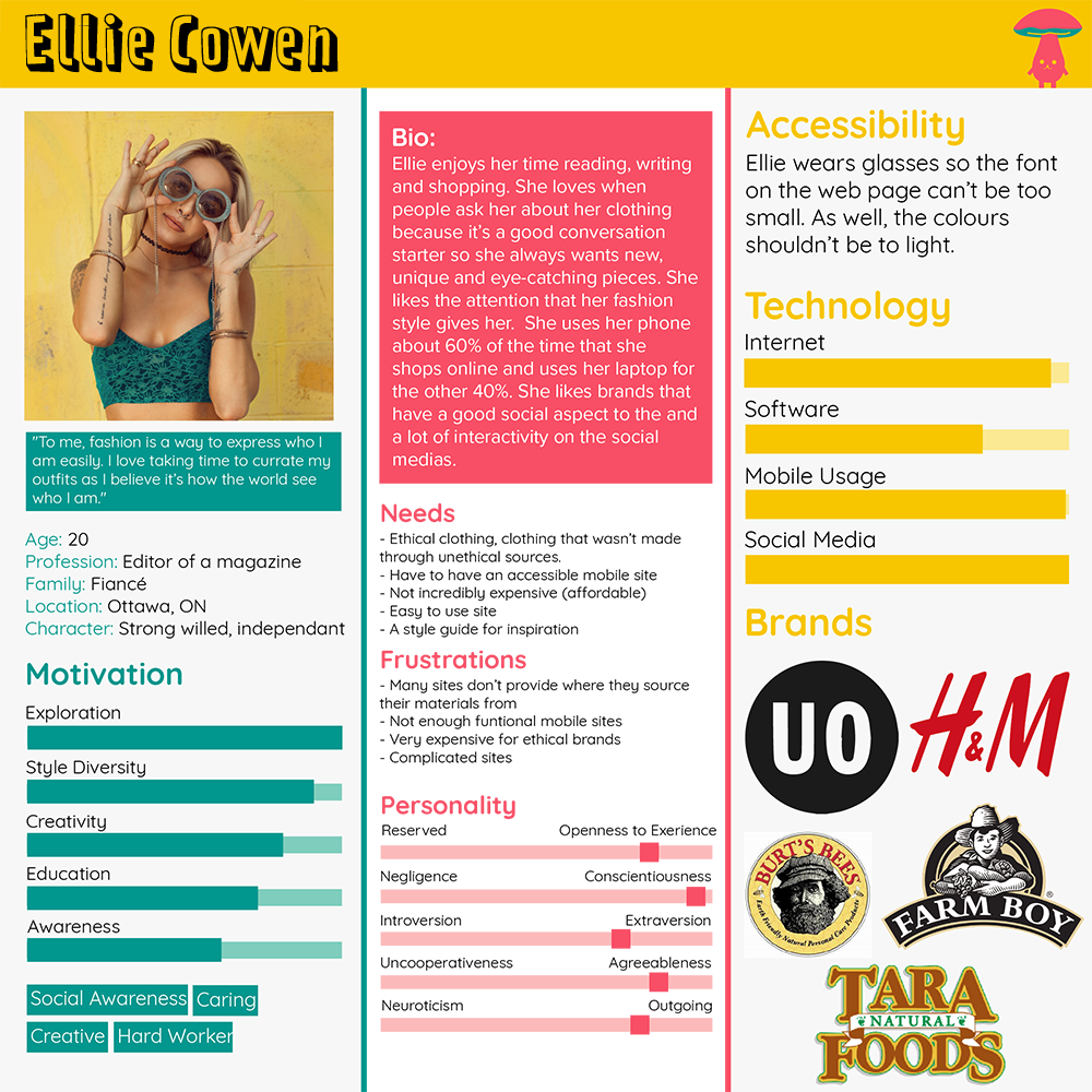
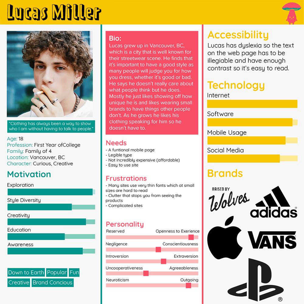
People who are fashion-forward and enjoy fashion. Usually both males and females between the ages of 16 - 28, who keep up to date on social media and enjoy expressing themselves through their fashion and appearance. Generally artistic and stylish, have a good sense of self. It uses bright fun colours that are also mature enough to draw the attention of young adults. Below are two personas of potential customers to the E-commerce site.
Competitive Analysis
Urban Outfitters
About
Urban Outfitters is a lifestyle retailer dedicated to inspiring customers through a unique combination of product, creativity and cultural understanding, offering experiential retail environments and a well-curated mix of on-trend women’s and men’s clothes, from boho dresses, denim and graphics to shoes, hats, and backpacks, as well as beauty, intimates, swim and a collection of handpicked vintage clothing.
Target Audience
Teens and young adults who are into fashion.
Strengths
They have a very recognizable brand, they put a lot of effort into brand awareness and putting their brand forward in style. They try many new things and the site is pretty straight forward. They use clear descriptors for their clothing, clearly state any partnerships and what materials are used.
Weaknesses
It is difficult to find an about page for them to explain their branding and style guide. Most online clothing stores give you at least a little bit of an idea of how they represent their brand and how they think their clothing should be styled. (their product cards include models wearing the clothing and showing off the unique styling which could be used for a lookbook but it would be nicer to have a real book).
Visual Design
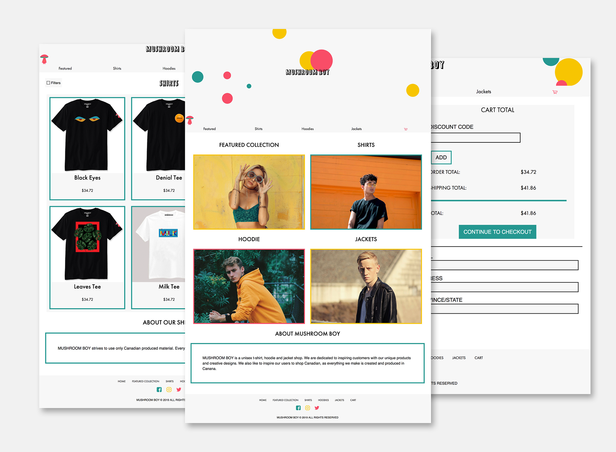
After I was done the research, I started thinking about how I wanted the site to feel. I wanted something modern but eye-catching. To achieve this I kept the site minimal in elements but added a lot of personality to the site. To get a full idea of how all the elements of the site would tie together I created a high fidelity wireframe in Adobe XD.
Typeface
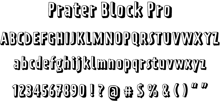
Prater Block Pro and Futura were chosen as the fonts for this site because together they give off the sleek modern vibe with a hint of personality. Prater Block Pro was specifically chosen for the font of the title because it had a fun youthful feel to it, which represented the brand and put a strong idea of what the user should expect.
Prater Block Pro was paired with Futura because Futura is a sleek and modern typeface. Futura tied together all elements of the site's brand by not having a large amount of personality, this let the site speak for itself.

Colour Palette
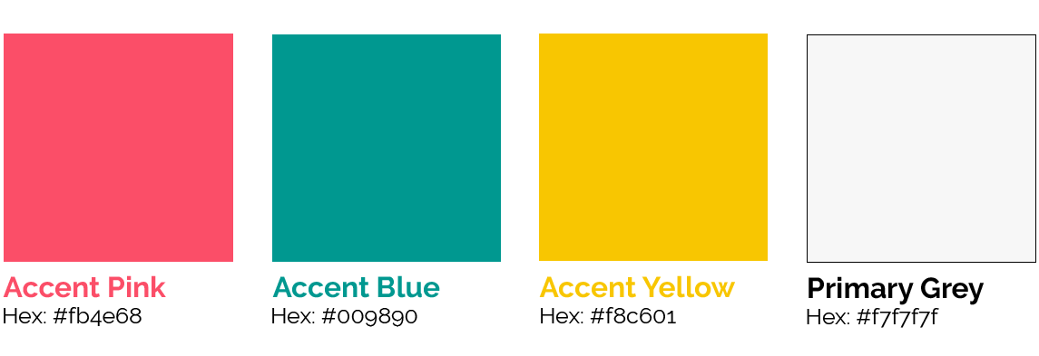
These four colours were picked out because they all compliment each other well. The pink, blue and yellow were chosen as fun, youthful feeling colours that added a pop to the site. The primary grey was chosen as the alternate background colour aside from pure white, giving a bit of contrast to the site.
Bringing it Together
Once the visual brand was thoroughly thought through, the next step was to start designing the layout of the site. The homepage was designed to be minimal with the sole purpose of drawing users further into the site. The main banner for it was larger than any other page to announce to the user what site they were on and to give the site a bit of life with the animated bubbles moving around. Additionally, each accent colour corresponds to a collection of items, which helps enforce the colours as part of the brand and brings all the pages together.
To start the coding process, I downloaded a whole bunch of things to get my pattern library up and running... (It was a long process) Once all the downloading was done, I started by breaking my wireframe site down into repeating patterns. This is a vital step when creating pattern libraries since it groups and trims down patterns and lets you know which patterns can become a collection. A collection is one repeating pattern that, with the help of some Markdown files, can spit out different pieces of code that all look the same but each has different information, which is very handy when you are making a products page.
Coding for a pattern library has a steep learning curve, but I got used to it quickly once I understood how vital the file structure is. Each pattern gets its own folder and each folder has an HTML, CSS and config.YML file. This gives each pattern it's own HTML file, a CSS sheet to reference for styling and a config.YML for an explanation in the pattern library.
After I had all my patterns made, all that was left was to place each piece into its respective place. I created a few layouts that would be used around the site that held common patterns like the navigation, the header and the footer. Then made HTML files for each page and placed in the appropriate pattern and array. In all, the building of the site was the shortest amount of time, all it took was a little bit of code and placing some patterns.
Next Steps
The next step with this project would be to build out the rest of the site, as right now, only a select few pages of the site are up and running. As well, getting the site up to internet standards, adding all SEO and meta data, would follow close behind.
