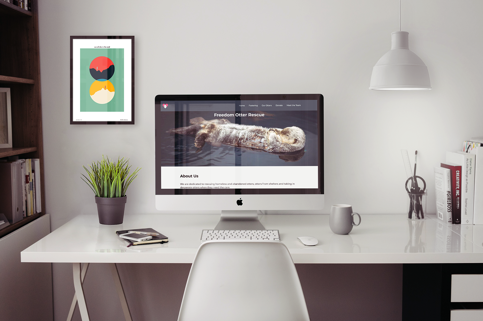
Overview
Provide an “update” for the website for the Freedom Dog Rescue. We were tasked with finding a “bad” website or one in need of a revamp and update it. As well, we were told to be creative with our animal picks.
Process
Research
Freedom Otter Rescue was initially a rescue website for dogs but since we were instructed to get creative with our animal picks, I chose otter. The research was done with the mindset that otters are a common family pet and as such would attract the same people as those who would want a dog. All the research done was to find out why the original website was not working, why competitors were doing better and give insight into what could be done to revitalize this site.
Website Goal
The goal of this website is to convince people who are looking at it to become a foster to help the otters. The site should make people feel for the otters and want to support and/or foster them.
Target Audience
Anyone who would be interested in fostering an otter and give it a loving family. As otters are an uncommon household pet, they need lots of attention and care, we are looking for people who are willing to commit an otter. The target of this website would already be interested in otters and know a lot about them as they would be looking to foster, they would also be an animal lover who is interested in otters or maybe just general public who are looking for a non-profit organization to give donations to animals in the need of a foster home.
Competitive Analysis
Dog Tales Rescue and Sanctuary
About
Dog Tales was founded in 2014 by an animal-loving husband and wife team - Rob and Danielle. Both had been involved in rescue for years before finally deciding that the best way to help animals in need was to open a rescue of their own.
Target Audience
Adults who are looking to rescue a dog or other animal. This site has a lot of other animals to foster and/or rescue.
Strengths
The site has a lot of pictures which catch the eyes of the user, it has clear titles for their banners and directs the user to what they are looking for quickly.
Weaknesses
It is a very simple site, there is not much information on the home page when you come in. As well, their navigation is a little finicky and hard to get the dropdowns to work.
Visual Design
After all the research had been done, I started to think about how I wanted the site to feel. I knew the site had to feel professional but it also had to feel welcoming. I strived to be professional without being cold and friendly without being unprofessional.
Typeface
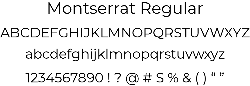
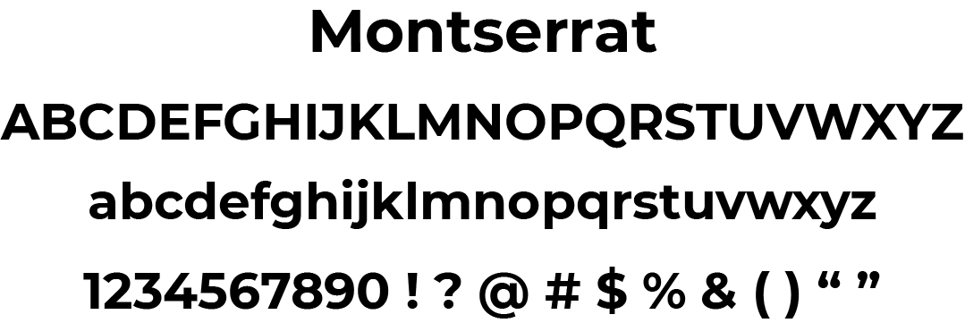
Montserrat was chosen as the typeface for this site because of its wide-open face. It is very inviting and friendly-looking, which also having a professional feel. The qualities represented by the font are all qualities that are represented in the site, so choosing this font was a no-brainer.
Colour Palette
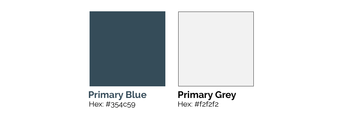
A very limited colour palette was chosen for this site, allowing the images of the otters to speak for themselves. The blue was chosen because it is a bit on the darker side (it was a swatch taken from the image on the home page), this helps keep the focus on the images of the otters and the darker aspect lends well to a very professional feeling. As well, blue scientifically makes people feel calm and trusting which is an important factor in getting people to like what you are presenting to them.
The primary grey was chosen for the background colours because it softened the site and gave it a more welcoming feel. Having a stark white background created a lot more of an “in-your-face” tone which was not what I was going for.
Bringing it Together
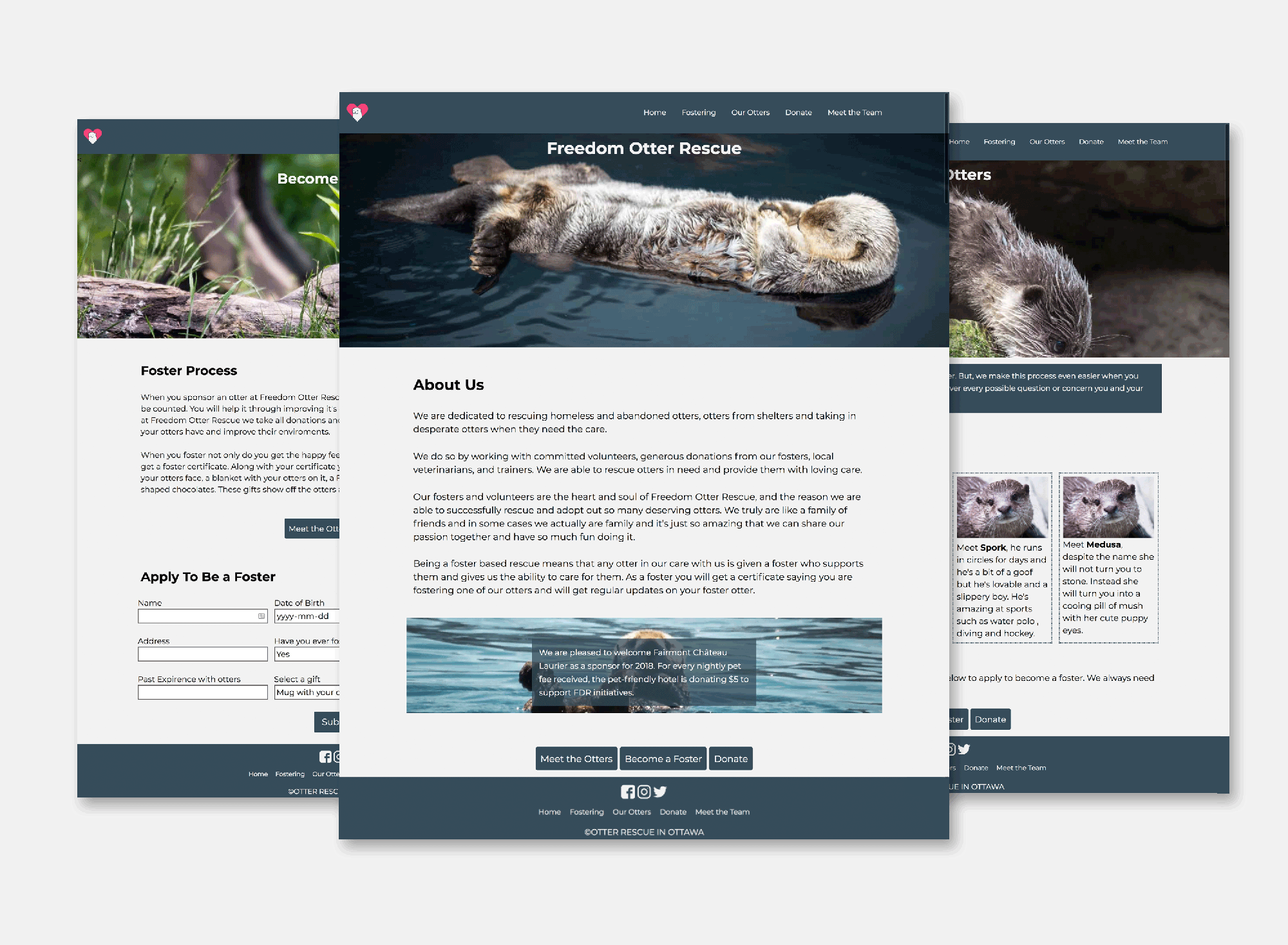
After the visual design was finished, I got into coding. For this site, I coded all the similar features of each page like the navigation, the header and the footer, adding in a few different classes to create the different background images for the banners. I then went on to add all the content for the site, making sure to follow the XD file that I had created during the visual design process.
Next Steps
The next step I would take with this site would be to add a bit more white space around the site. Looking back on it, the content is a bit tight and the addition of more white space would loosen up the site.
