Overview
Creating a new website for the company Marketo, a company which handles online marketing for their clients. Covering the basic needs of a SAAS website and being accessible to the user were key aspects of the site that had to be met.
Process
Research
Marketo is a software subscription service for businesses to streamline their marketing progress. They use a variety of services such as web advertisements and social media integration. They need a simple site that communicates to their users what they do and what they can do for them. The research done was to find out who specifically to target and what the goal of the site was and how to improve on meeting both of them.
Website Goal
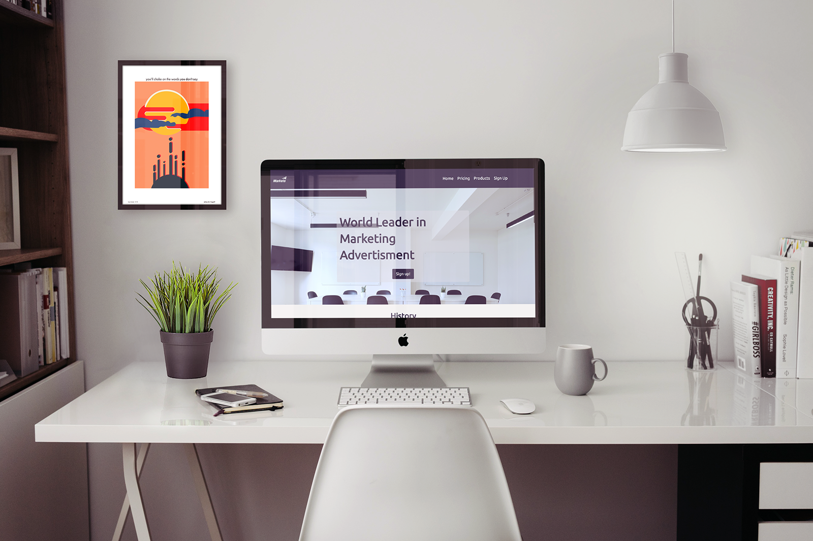
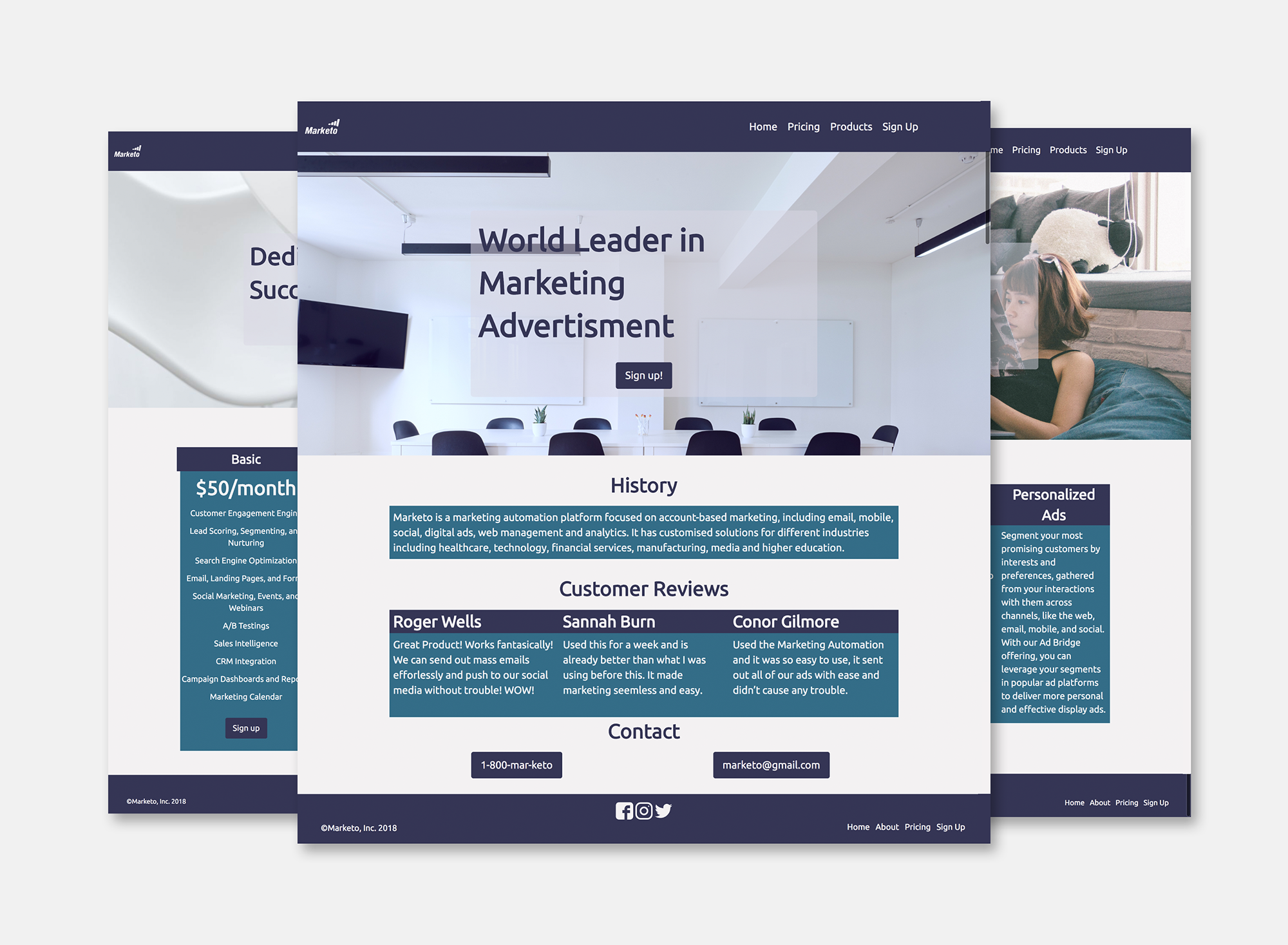
To attract new customers and explain who Marketo is and what they do simply and understandably. The project I was tasked with was to revamp the website they had at the time, the site was filled with pictures and took a while to load.
Target Audience
Small businesses and global enterprises that need a simple marketing solution to promote their business.
Visual Design
Once all the research was completed the visual design was constructed, keeping in mind that this is a very professional website that deals with a lot of knowledgable clients, meaning the site has to be straight-forward and easy for them to use.
Typeface
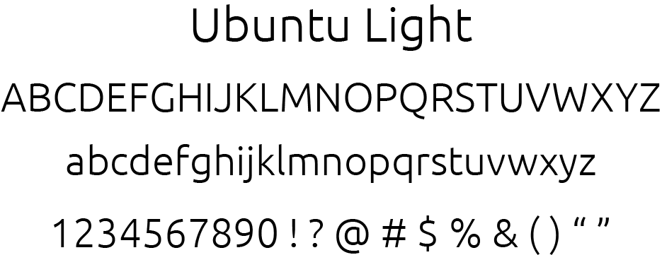
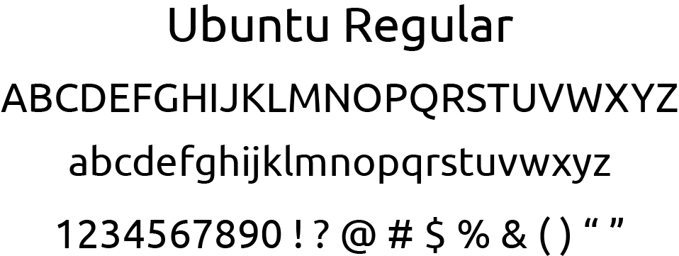
Ubuntu was chosen as the typeface for this site because of its technological feeling. Since Marketo deals a lot with technology and is of a trusted with the business of others, having a typeface that makes the user think of technology was important. Ubuntu created a good basis for the rest of the site to rest on, giving people a good idea of what to expect from the site as soon as they get into it.
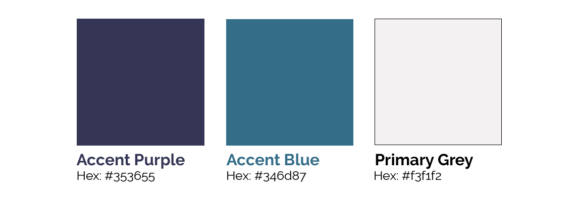
Colour Palette
Purple and blue were chosen as the main colours for the site since purple was a colour Marketo had used previously, although this one is more muted and blue complemented it nicely. Purple and blue together create a professional feel, nicely complemented by the photography that has a lot of blue and purple tones. #F3F1F2 was used for the grey background to compliment the purple, having a light purple hue to itself. All three colours together give the site a comprehensive feel, making the user more likely to trust the brand.
Bringing it Together
Once research and visual design has been created, I began with creating similar elements between pages. I referenced my XD file on how I should create and style every page.
Next Steps
The next step I would take would be to loosen up the site a bit by adding more white space and soften the way the site looks by adding rounded corners around the boxes.